Search

It's Yikii

CSVPA study journey

Month

November 2016

Research | Brands & Artists  

BLK DNM

Fall 216

07-blk-dnm.jpg09-blk-dnm.jpg08-blk-dnm.jpg

The five-year-old Swedish label does so by stripping away all unnecessary decoration, branding, product names, even designer credit, so we can see those clothes are very minimal, unobtrusive, however the look book is different from the style of the design, model show the clothes with a long jacket, so we can see the line of clothes when we are moving, so that although all the design is minimal, but the style looks like more dynamic. I think it is a good way to show the clothes which are designed without much decoration.

Gypsy Sport

Spring 2017

Easy to see, the notion of this season is about sport like baseball, football, basketball etc. This collection showed the football jersey, a piece of West African indigo fabric, trimmed with lace, which are very special I think. The first impression when I see this brand, it is full of living colour, masculine and feminine are turned upside down and inside out, also the fringed with tassels attracted me. When we are walking, at the same time with tassels around the swing. The trimmed with lace don’t limit the figure and asymmetric flapper dress is like the sea wave which shows the frequency and dynamic.I think movement not only the action of the moving, also can be a concrete subject like the fringed with tassels and asymmetric dress, which have a tendency to move.

Rick Owens 

FW 2017

Rick Owens usually use the minimal and  simple color, which are the same color or the pure color in a style, but we can see there are several layer in a clothes, for example, the garment is very free, unconstrained and disengaged,it don’t limit the body, which means it give the space to let body move. Besides, we can see some shapes interlace and look like the river flowing. The fabric also have good texture, so that the drape can hold stably.  I think this brand show us the movement in the garments, although the model stand here, we still can feel a sense of flow and dynamic.

Group work 

Day 1


  Today we did the group work, the topic is about the movement. At first, we talked about the word “movement” what is meaning. Someone thought it is the action of moving like walking, writing, picking-up the stuff, someone thought it is a series of movement, next we wrote down some ideas and did a mind map. Then we went outside to use took some photo, for instance, we took some photo when people was walking and observed the movement of the garment, there are some folding and changing the shape of the clothes. Also we imagined a person who woke up and he/she wanted to dress up, there are a series of movement when people dress themselves. Afterwards, we came back to the classroom and took some photo when a girl touch the hair, so the bullerfly sleeve floated and we can see the folding of the sleeve, there are the movement with the action. Also Blues dressed a long coat and did some action like turning around, dancing, jumping and so on, we can see the lower hem of the jacket was moving. Besides, we also did some drapes, when we changed the shape of the garments, it is the movement about the garments. 

Before the end of the class, we had a small presentation among two group. Each group explain our mind map and some photos which was chosen. From aother group’s presentation, it extended my mind to the word “movement”, then I know I also can think about the color, history of the fashion, texture and other different type to explain “movement”. 

Primary Research Project Sainsbury Centre for the Visual Arts, Norwich

15/11/16

Today we went to the Norwich and visited 2 main exhibitions which are The Sainsbury Family Collection and Fiji-Art and Life in the Pacific.

ABOUT : The Sainsbury Family Collection

THE BUILDING

Designed between 1974 and 1976, the Sainsbury Centre for Visual Arts was the first major public building designed by now renowned architect Norman Foster.The chosen location was a sloping east-west site by the River Yare, at the very edge of campus.With the need to house many functions under one roof, Foster’s solution was highly innovative. The building is a prefabricated modular structure formed around a steel framework, with individual aluminium or glass panels assembled on site.Spaces between the external cladding and internal shutters house plant and service functions. An underground corridor runs along the building’s spine, to access to storage and workshop areas.(Search from : http://www.scva.ac.uk/about/the-building )

HISTORY

When the Sainsbury Centre first opened its doors in 1978, the ‘Living Area’ space inside that displayed the Sainsbury Collection was also ground-breaking.It was designed as a place of visual communication. All objects were housed at comfortable eye-level in small groups within free-standing square or rectangular cases to enable 360 viewing. The Sainsburys did not want a museum but for people to view objects closely and to appreciate them in the way they had themselves, with minimal labelling.(Search from : http://www.scva.ac.uk/about/history )

COLLECTION

The Collections at the Sainsbury Centre for Visual Arts represent some of the most remarkable works of art assembled in the United Kingdom, spanning some 5,000 years of human creativity. (Search from : http://www.scva.ac.uk/about/collection )

In this exhibition , we saw a range of artwork which are really amazing. And I choose several art work which I most interesting in it .


In this painting , from the title we know this is a head of a man which means that is a portrait , and we can see this painting is a side of face , the color is used in this painting which almost is cold tone but with a little bit red tone , besides , we can see the expression in his eyes looking down , so I guess this guy may feel depressed and disappointed. Additionally , from this painting , we can know this is an abstract art , because if we want to draw a realism portrait , we will draw very careful as the appearance of the face , but in this painting we can’t see the real appearance of the face. A little bit rad color is the point in this painting I think , because if all the painting are the cold tone ,may we will feel boring ,but he add some red to make the painting more alive .


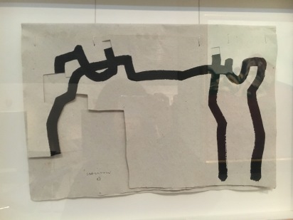
In this work , he used a lot of material which are the ink on paper , carve and string .The sculptor works within abstraction, employing geometric forms and linked shapes to create towering and physically imposing works. Chillida’s sculptures reflected his interest in space and materiality, and  he just use the simple line to show the space and content. There is a saying that less is more , I think this work is doing a great job of representing the opinion.Besides ,we can know from the shape which is very abstract , there is a standing person looking in the distance . From this artwork , I was inspired and in the following study , may I will use the simple line or just few detail in my design ,which is enough showing my point .


Firstly ,the most attracted me is the cute and special shape with the distinctive pattern , there is a special kind of national character . The obverse side we can see there is a person sit in a animal (I guess ) , the back side is a pattern which looks like a ladybug . Because it was a national object and from North America and Northwest Coast , so most often associated with shamanic practices on the Northwest Coast, raven rattles are held oriented with the bird’s beak pointing down when used in dance.Additionally, rattles like this are used to channel a shaman’s spirit guide and can be used in healing ceremonies.


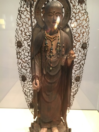
This Jizō-Bosatsu (Ksitigarbha) with its warmly elegant face.This is an important extant example of a work whose date of production, commissioner and contributors to the inscription found inside of the sculpture. It is also the symbol of the Buddhism ,and very similar with the China . In Chinese history , many people who believe the Buddhism are very extensive. Additionally , the appearance of the sculpture are also very similar , the back side have the pattern of aperture ,  the figure of the Buddha are standing in the lotus flower , and the hand hold the staves .


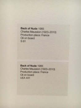
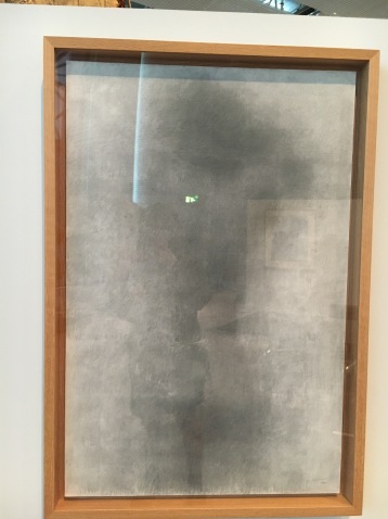
Those three painting all about the back of nude ,but from different period , the first and second are in the 1985 ,the third is late 5 years . And we can see from the development , the size become more and more bigger and the content become more and more indistinct .The first we can distinct see the shape of body ,however ,the third one we can’t make out the appearance of the body , so we can guess as time goes by the style of the painting become more and more abstract .  Besides , there is another interesting thing ,which the painting is made by oil and acrylic ,but when I first time see this , I think those make by the pencil or  color pencil . The texture of painting is very special , and we also can know the artist have  great drawing skill.


IMG_2803.JPG

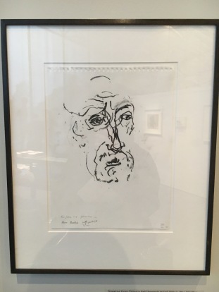
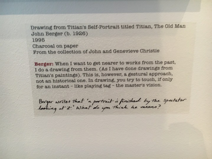
This is a self-portrait from Titian , he draw the old man who is John Berger.  We can see in this drawing , he just use the simple line to draw a head ,even without any tone ,but also we can see the expression of his eyes ,which looks very serious and solemn .Besides , there is a line of hand written words in the following paragraph , which writes ‘a portrait is finished by the spectator looking at it .’ In my opinion ,I think this sentence means if we draw a portrait , we will as a spectator or a bystander to reassess ourselves , we need to throw off all partiality and be honest to ourselves , so that we can draw the true self .

Photography evaluation 

Before I start to learn the photography , I have interest in taking photo , and also I think photography is around our life , so many aspects will use the photography , for instance , there are many photos in magazines or newspaper and even you go to a restaurant , the menu also have many pictures , so photography consist in our life. Besides , nowadays photography is more and more important in our life , due to the fast development of social and economy ,people are prefer to watch a picture rather than read a paragraphs. This is my opinion why I am willing to study this rotation.
 

   In our first project is about the Royagraph , before I begin to research some information about this word , I don’ t know what exactly it is. After I got some information about it , I am very surprised , because it let me know there are another way to create a picture which don’t use the camera. It likes to draw a photograph , not the traditional meaning about photography. Making a Royagraph firstly light the photographic paper , next use the developer and fix liquid , then clean it and let it dry . It is not very complicated , but also not very easy to get a good piece , because we need using the experience to control the time of light and steep in the liquid , if not sometimes will too light , sometimes will too dark.
 

   Through the whole rotation of the theme is about the surrealism , so we learned to take photo in the studio using the flash light and slow shutter speed to make the affect of the multiple exposure. It’ s very interesting to create the action or the story in one photo , and also we took photo in a group , we communicated with the member and gave the different opinions , I think it is a good way to improve the cooperation with other people , it is a very important skill when we start to work. The following project is to take the photo about reflection. Reflection also a good way to show the surrealism ,reflect the different things in one picture or maybe there is a story in the picture.
Afterwards , I searched a range of artists and photographers , also some information about the Surrealism and Dada , then make a collage about the social media control people’ mind and a photo story about two girl come across in the toilet . This project is the most interesting part for me , because I think use the some connected picture to tell a story and when we just see the part of photo ,we maybe don’t know the fact of the story . Dada collage is also inspired me a lot not only in collage ,but also in photography , which means we can edit the photo ,maybe cut a piece of photo or put some color in it , don’t limit in the frame. Besides , we also make the surreal advertisement and the symmetrical joiners , I ask tutor and friends a lot question about how to use the photoshop to edit the photo and I practice more in my work ,so I think my computer skill improved , which is very useful for my.
 

   Additionally , we read the website about the surrealism and learn a plenty of knowledge , which are the development of the surrealism , the history of the objects and so on. Also , we went to the library to copy some magazines ‘ articles which the photograph inspired me . It both very helpful me to realize the deeper meaning about the photography and surrealism. We also studied how to use the digital camera and used the function about the shutter speed , aperture and Iso. It is useful skills for me to take more nice picture. I practice many time , taking the photo both in studio and outside , I also do some own work which is about the warm light let individual feel warm. About my final piece, I got three different ideas from the different way , one is from a movie ,one is from my dream diary ,one is the experience after I went to the London. In the presentation , classmate and the tutor gave me the suggestion which is choose the first idea as my final piece. I think presentation is a great way to know other people’s ideas ,what they think ,how they develope the ideas , we can learn a lot from other people.

   
From this rotation , I learned so many skills about how to use the digital camera and also how to use the photoshop to edit pictures , besides , I comprehend the photography more deeper. I enjoy taking photos and enjoy using camera to record life , very glad to own this experience to study more knowledge about the photography. 

My own work | 06/11/16

This weekend I with my friend went to the London and when I took the subway and saw a range of people ,I inspired from this  a lot. Now almost people want to live in city and individual live in fast pace of life , because they need to earn more money to support them live in city or live more better life , so people always very busy. We can see lots of people look like very tired in the subway and we can feel people quickly passed by.

So I took some photo about the strangers passed by us ,we don’t know about them , because of the busy life. I use the low shutter speed to take them , because I want to show the main focus is the individual and the other are just the shadow. We also went to the Chinatown and I saw many red lanterns in there , then I just feel warm ,don’t have another reason ,but still feel like I went to the hometown. So I also took some photo using the warm tone.

Life drawing & Visual studie | 03/11/16

Life drawing

Today we drew the woman’s body with the pencil and color pencil. The different between today and before was that we need to draw the tone of the body and muscles. Tom gave us more time to draw , because he wanted to us draw more accurately and used the shadow to represent the tone of body. Until now I am not good at drawing tone for the body , I think maybe I should observe more carefully and use the shadow to represent the stereoscopic body.
Visual study 

This week we draw a little bit different which is panorama photos. Nowadays in our phone almost have a function which is taking panorama photos, it meaning that we can take the scenes not only just have one side also can include the all sides scenes. At the beginning , I am not sure how to draw this , because when I use my eyes to observe the environment ,I don’t know the angle and size of the objects ,and also confused with how to array all the object. So first time I drew the wrong way ,I drew everything ont the straight line , however , it’s not the panorama photos , then I change it ,I drew the objects on curve line and the angle of the objects are connected.

Life drawing & Visual study | 10/11/16

Life drawing

This week we use ink to draw several human figures, but a little bit different is that we use the not only the brush also the prod . I think the prod is a good material to draw the line of  the body and using the brush to draw some shadow in the figure. This week we just spent short time to quickly draw the figure ,so we can’t draw very detailed , we just draw the shape and action of the body and put some tone in the figure . I think using ink is very difficult to control the amount of the ink , so maybe I need practise more to make it better.

Visual study 

Today we have the team work which is drawing a huge tree . At the beginning , there are some problem ,because the piece of paper are not average , so maybe lead to can’t connected with others. Then ,with the help of the tutor ,we successful cut the average piece paper and organise three people as a group . We follow the paper and draw it down , however , different people have different style to express. Finally , we put all the printing together , it’s surprising that all the paper can be connected and the final work is quiet great .

Some ideas about the final piece 

Idea 1 


Few days ago , I watched a movie called he is a dragon which is a Russia movie. In this movie , the main male character is a dragon and his ancestors usually  arrest the bride when the people was singing the song called the song of dragon , so he took the girl in the instinctive sense. However , after a period of time to get along,the girl falled in love with the dragon , and then he taught the girl some special power , One of them is that he can see the direction of the wind. I think it is really cool when I first time saw it and inspired from this. I imagine that  maybe oneday people can see the wind or even control the things what ever they want.

So I took some photo and use the photoshop to edit them. There are the example about the making process.

Idea 2

I want to express the theme is  about the opposite of the world.  Because sometime when I am doing someting and the other are doing another thing or maybe when people talk about something which they are interesting in it , but I don’t interesting in it , then I will feel out of tune with the world. I just stand there , but  feel the world is in turn, whatever how beautiful of the world , I still feel boring. I want to use the opposite of the background and the person stand there who don’t have the expression.

Idea 3

This idea is connected with the experience which I went to the London last week. Nowadays , we are willing to live in the big city which have the convince transport and rich in the resources.  However , people are living in fast pace of life , they usually shuttle in the crowd and miss a lot scenery in  the life . Everyday we will meet so many people ,but almost are the passer-by , we definitely meet them but we still don’t know each other . Although we meet so many people and have many friends ,no matter where we still feel lonely in the life . In the crowded underground station , the fast subway and throng cross over you and sometimes will let us feel the city or the life are full of the busy ,busy ,busy .

Go to the gallery | 12/11/16

This weekend I with my friend went to the London and saw three different gallery which is the Photography Gallery ,Lomography and V&A Museum.


First ,we went to the Photography Gallery and I really like it. I realise that I can use the different material to mix the photography work ,such as the lines , circle,some special shape and so on. Also we have so many different way to show the final presentation, not only just print out the photos ,also can use some object which can link to our work. Then we went to the Lomography , we saw so many Lomo camera ,it looks like really cool , however , we didn’t go downstairs to see other photos ,because we think  the place is very small and we can search more information about this from the internet. In the end ,we went to the V&A Museum, it’s a wonderful place to learn different information ,there are so many different types work , I am very interesting in fashion ,so I saw I a lot of garment which is very old but beautiful. I also saw some old photography, I think the film noir is the most I like , used the black and white to the story or the object ,actually how to take them using the film camera is a difficult thing,we need to practise so many time ,then maybe can choose one of them. 

Create a free website or blog at WordPress.com.

Up ↑